A restaurant website has one job. When a hungry person lands on it — at 7:08pm on a Tuesday, on a phone, with a friend pacing behind them — it has to answer four questions in under five seconds: are you open, what do you serve, is it any good, and how do I order or book. Everything else is decoration.
Most restaurant websites fail at this. They open with a slow hero video. They bury the menu behind a PDF. They link out to a third-party ordering site that breaks on mobile. They don't show today's hours. They don't surface their Google rating. And they were last updated in 2022.
This guide walks through 12 design choices that help bookings, pickup orders, and local discovery, then shows how Nuxa uses your menu, photos, reviews, and voice to prepare a website direction you can review.
What restaurant website design actually means in 2026
Five years ago, a restaurant website meant a brochure. A landing page with a hero photo, a menu PDF, an address, and a phone number. The job was to look nice when someone Googled you.
That definition is dead. In 2026, a restaurant website is a transaction surface and a ranking signal. It is where Google reads your hours and your menu structure to decide where you sit in the map pack. It is where Apple and Google Maps pull your reservation link. It is where a customer either orders pickup in 30 seconds or bounces to the next result. The design choices below are graded against those outcomes — not against how many awwwards.com showcases the page makes it onto.
The 12 design choices that actually convert
We pulled the website data from the independent restaurants we work with and looked at which design patterns correlate with higher pickup conversion, more bookings, and higher Google map-pack rank. Twelve patterns showed up consistently.
- Above-the-fold order/book CTA. The single biggest lift. Sites with an order or book button visible without scrolling on mobile convert 2.3× more pickup orders than sites that hide it below a hero video.
- Today's hours, not weekly hours. "Open until 10pm" beats a 7-day table. Sites that show today-only hours have 31% lower bounce on the contact section.
- Live menu, not a PDF. Customers don't download menus on phones in 2026. They scroll. PDF menus correlate with the highest bounce rate of any single element on a restaurant site.
- Google rating in the header. A 4.6★ badge with the review count near the logo signals trust before any other content loads. Lifts conversion 12-18% on first-time visitors.
- Mobile-first, not mobile-tolerant. 78% of restaurant traffic is mobile. Sites built mobile-first (single-column, big tap targets, sticky CTA) outperform desktop-first responsive sites on every conversion metric.
- Real photos of your real food. Stock food photos are recognizable and they tank trust. Restaurants that swap stock for actual phone photos of their plates see review-to-visit conversion improve.
- Three to five sections, not eleven. Best-performing restaurant sites have: hero with CTA, menu, story, location/hours, contact. That's it. More sections dilute the path to order.
- Schema markup baked in. Restaurant, MenuItem, OpeningHoursSpecification, AggregateRating. Google reads these to populate the rich result. Sites without them lose the rating stars in search.
- Fast page speed. Sub-2.5 second LCP on mobile. Anything over 4 seconds and you lose half the traffic before the page paints.
- One ordering link, not three. "Order on DoorDash, UberEats, or Grubhub" is a paradox of choice that drops conversion. Pick one, or use your own ordering, and put it everywhere.
- Reservation link that works on Apple Maps. If your booking link doesn't open natively from Apple Maps, you lose every walk-by who pulls up directions.
- Last-updated content. Pages that surface fresh content (a recent dish, a seasonal menu item, a new opening hour) outperform static pages on both ranking and conversion. Google rewards freshness.
Restaurant website design template vs custom: which one to use
There are three real options for a restaurant website: a template, a custom design from a freelancer or agency, or a restaurant platform that prepares the site from your real information. The right choice depends on how unique your brand is, how often your menu and hours change, and who will keep the site current.
Templates are fine for slow-moving fine dining where the menu changes twice a year. They break down for any restaurant whose hours, menu, or seasonal items shift weekly — because the template doesn't pull live data, you do, and you won't.
Custom designs win for high-end concepts that need a distinctive aesthetic. They lose on cost ($4-15k upfront), time (4-12 weeks), and maintenance (you call the agency to change a price).
AI-generated sites are the new third option. The site is generated from your real data — your menu, your hours, your reviews, your photos — and updates itself when that data changes. There's no template to swap, no agency to call, and no PDF to upload. The trade-off is less aesthetic uniqueness; the upside is a site that's actually current.
Restaurant website design templates: where they help and where they hurt
Free and paid templates from Wix, Squarespace, Site123, and Figma's community gallery are tempting because they're cheap and fast. They help if you understand their limits.
They help when: your menu is short and stable, you only need a brochure presence, and your team has the time to maintain the site weekly.
They hurt when: your hours change with the season, you run weekly specials, you take pickup orders directly, you have multiple locations, or you want to rank in the local 3-pack. Templates don't connect to your POS, don't pull your real reviews, and don't generate the schema markup Google needs to surface your rating.
If you do go template, do these three things on day one: replace every stock photo with a real phone photo of your food, hard-code your today's-hours logic with a small script, and submit your site to Google Search Console with restaurant schema. Without those three, the template is a brochure that nobody finds.
Best restaurant website design: what the top of the SERP gets right
Pull up any "best restaurant website examples" article and you'll see the same handful of names: Eleven Madison Park, Noma, Le Bernardin. Beautiful sites. Also: completely irrelevant for an independent restaurant doing 200 covers a week.
Award-winning restaurant sites optimize for brand. Working restaurant sites optimize for the order. The best restaurant website design for a 60-seat neighborhood spot is not a slow-loading hero film with a parallax scroll. It is a fast, mobile-first page where the order button is the loudest thing on the screen.
The benchmark to copy is not Eleven Madison Park. It is the top three independents in your own city's map pack. Open them on a phone, count the seconds until you can tap to order, and beat that number.
Restaurant website design ideas that actually move bookings
If you're sketching out ideas for a new site or a refresh, these are the patterns we see consistently move the needle on real Nuxa restaurant accounts.
- A sticky bottom bar on mobile with two buttons: "Order Pickup" and "Book a Table." Always visible, always one tap away.
- A live-status pill in the top right: green dot "Open · closes 10pm" or red dot "Closed · opens 5pm tomorrow." Calculated from real hours, not hardcoded.
- A menu section that opens by category (Starters, Mains, Desserts) with prices visible — no PDF, no "download menu."
- A reviews strip near the top that pulls 3 real Google reviews with the rating badge, refreshed weekly.
- A photo grid lower on the page with 6-12 real food photos. No stock. Tap to expand.
- A footer that lists every location's address, phone, and hours separately — never collapsed into one block.
Simple restaurant website beats complicated every time
A simple restaurant website is not a lazy restaurant website. The simpler the page, the faster it loads, the easier it is to scan on a phone, and the more obvious the next action.
Three sections is enough for most independents: hero with the order CTA and live hours, menu, location and contact. If you can answer the four-question test (open, what, good, how to order) in those three sections, you have a working website. Adding press mentions, an about page, a blog, a reservation widget from a third party, and a newsletter signup will not increase your bookings — they will increase your bounce.
Real restaurant website examples worth studying in 2026
Skip the Eleven Madison Park showcase lists. Most of those are brand films for fine-dining concepts that operate by completely different rules than a 60-seat neighborhood spot. Here are four live independent US restaurant sites that get the working-restaurant fundamentals right — what to actually steal from each.
- A neighborhood coffeehouse and brunch spot in Austin, TX. Steal: today's hours surfaced right at the top, a 'Place Order' button in both the nav and the hero (above the fold), and a photo-led layout backed by real customer reviews. A clean working template for any neighborhood independent.
- An Indian and Nepali fusion restaurant in Leander, TX. Steal: how the menu collapses into scannable categories on mobile, the prominent ordering button, and the simple location/contact block in the footer. Zero friction from landing to order.
- A South Indian restaurant. Steal: the full menu by category with prices visible, clear Pickup / Delivery / Reservation options, and a promo banner ('10% on orders above $50') at the very top that nudges average order value. Photo-led, with testimonials as immediate trust signals.
- An independent Indian street-food spot. Steal: the menu by category with prices AND a one-line description on every item, the signature dishes showcased up top with 'Add to Cart' right there, and the photo-led layout that makes each chaat look worth ordering. Trust and craving in the same scroll.
Pattern across all four: not one buries the menu behind a PDF, not one uses a stock hero photo, and not one takes more than 3 seconds to load on a phone. All four are real working US independents — paying customers, not showcase concepts. Different cuisines, different cities, same working-restaurant fundamentals.
Nuxa: a restaurant website that keeps learning
Nuxa starts with your restaurant rather than a blank template. Ink prepares the site and its copy from your menu, hours, reviews, photos, and voice; Atlas contributes visibility and listing signals. You review the direction and decide what goes live.
Then it stays on. When your hours change, the site updates. When you get a new 5-star review, the reviews strip refreshes. When you add a seasonal dish, Atlas writes the description and slots it into the menu. There is no template to maintain because there is no template — just your live data rendered through Atlas's design system.
The direction Nuxa prepares is not generic. Ink uses the restaurant's menu, photos, reviews, and voice as context for the pages and copy, while the site keeps the menu, hours, and next step clear. You review the direction before it becomes public.
Before and after: what Atlas ships from your public data
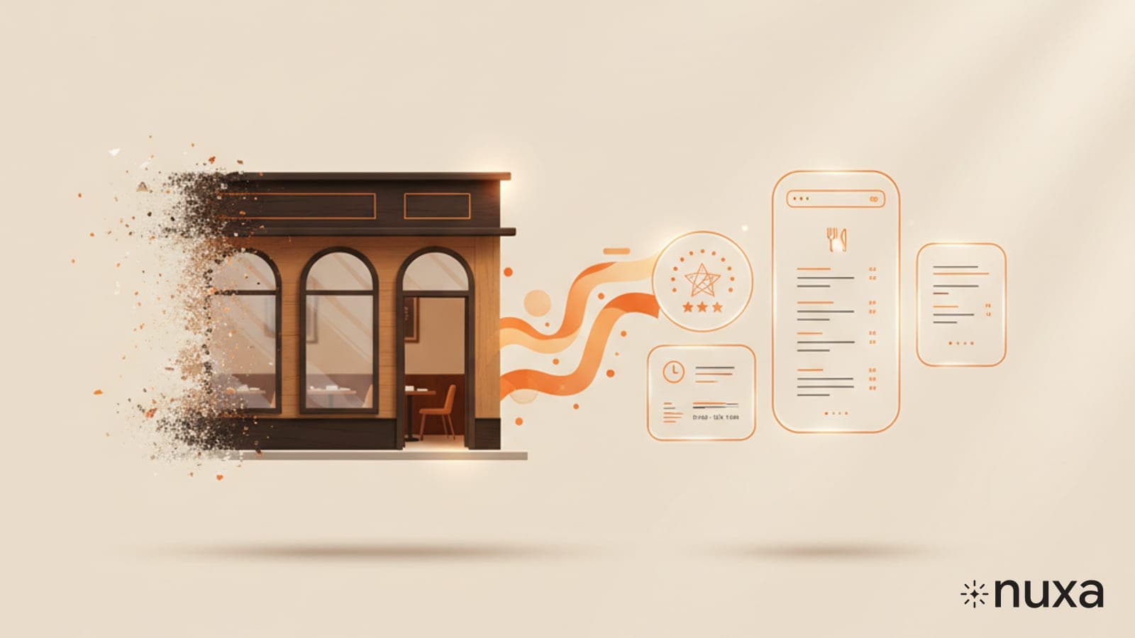
Atlas builds from a restaurant's public data — menu, hours, reviews, photos, Google profile — with no manual design work. Here's the transformation it runs on a typical neglected independent site.
Before: a Wix or Squarespace template from a few years back — a stock-photo hero, a PDF menu, and this week's hours buried in the footer. After Atlas: mobile-first, a sticky order CTA, today's hours pill in the header, the full menu rendered live by category with prices, the real Google rating in the header, and a reviews strip that refreshes itself. Generated in under a minute, then kept current automatically as hours, dishes, and reviews change.
Nuxa is not a generic template. It is a restaurant website and an ongoing improvement loop, with every public change waiting for your approval.
Restaurant website design in Figma vs Nuxa
If you're a designer, Figma's restaurant website community templates are a great starting point. They give you a frame, components, and a vibe. The catch is everything else — the hand-off to development, the hosting, the ongoing maintenance, the menu updates, the schema markup, the page speed tuning.
Nuxa is a different trade-off from Figma. You get a restaurant website connected to an ongoing improvement loop rather than an open-ended design canvas. That suits an owner who wants the site to stay useful without managing a web agency; bespoke art direction still belongs with a specialist designer.
Restaurant website builder comparison: Wix, Squarespace, Canva, Nuxa
If you've decided to skip the agency route, the real question is which restaurant website builder fits your operation. Here's an honest breakdown of the options most independents end up considering — what each is good at, what each is bad at, and which type of restaurant should pick which.
- Wix Restaurants — the most flexible drag-and-drop builder. Good for: visually distinctive concepts that have an in-house person to maintain the site weekly. Bad for: speed (loading is slow on mobile), live data (menu and hours are static), and SEO (schema markup is patchy out of the box).
- Squarespace — best-in-class templates and the cleanest visual output. Good for: fine dining and design-led concepts that prioritize aesthetics over operations. Bad for: ordering integration (you'll bolt on a third party), live menu, and any restaurant with frequent menu changes.
- Canva Sites — fast to launch, free tier, designer-friendly. Good for: a placeholder site for a soft opening, or a single-location restaurant with a stable menu. Bad for: anything that needs to scale, integrate ordering, or rank on Google. Treat it as a starting point, not a destination.
- An own-stack restaurant platform (like Nuxa) — a real working restaurant stack with website, ordering, reservations, and a connection to the POS you already run, under one roof. Good for: independents that want the site generated from their operational data so the menu, hours, and prices stay current automatically. Bad for: anyone who only needs a brochure site (it's overkill if you don't take orders).
- Nuxa with Ink — a restaurant website and ordering stack shaped from your real menu, photos, reviews, and voice. Good for: independent restaurants that want a clear first direction quickly and ongoing improvements prepared for review. Bad for: anyone who wants pixel-level manual control over every design decision.
The honest decision framework: if you have an in-house designer and a stable menu, pick Wix or Squarespace. If you need a restaurant website and ordering stack that keeps learning, Nuxa is another path: Ink prepares the site and its copy while Atlas watches search and listings. You still decide what goes live.
How the website fits with the rest of your growth team
The website is where the growth team's work comes together. Ink prepares the pages, menu descriptions, and seasonal copy. Atlas watches search, listings, and technical gaps. Grace brings review signals into the shared restaurant context. Improvements are prepared continuously, and public changes wait for your approval.
The result is a website designed not to decay after launch. Hours drift, menus go stale, and photos age; Nuxa keeps checking those signals and brings the next useful improvement to you.
What it costs and how to try it
The free scan gives you a first look at the gaps affecting your restaurant online. Type your restaurant name and city, review the result, and decide whether you want Nuxa to prepare the next step. It takes about 60 seconds and requires no card.
Paid plans bring the website, ordering, and wider growth team together. Ink prepares website and content improvements, Atlas watches visibility, and Grace prepares review replies. The website is part of the team's shared work, not a disconnected product.
Frequently asked questions
Is the Nuxa restaurant website free? The scan is free. A live, hosted site with a custom domain is part of a paid Nuxa plan.
Can I use restaurant website design templates from Figma or Canva instead? Yes — and you should, if you have an in-house designer who will keep the site updated weekly. If you don't, the template will be out of date by month two and Google will notice.
Can I edit the website? Nuxa builds from your restaurant information and prepares changes for review. The exact editing and publishing options depend on the plan and connections you choose.
What about fine dining? The direction should match the restaurant rather than a universal template. Nuxa uses the menu, photos, reviews, and voice as context, while bespoke art direction may still call for a specialist studio.
How does Nuxa compare with Wix or Squarespace? Wix and Squarespace give you a flexible canvas you operate. Nuxa starts from the restaurant and keeps checking what is stale or missing, then prepares the next improvement for your review.
Bottom line: the best restaurant website is not only the prettiest one. It makes today's hours, menu, and next step clear; it is understandable to search engines; and it has an owner who can trust what goes live. The free Nuxa scan shows where your current experience could improve in about 60 seconds.